Composition
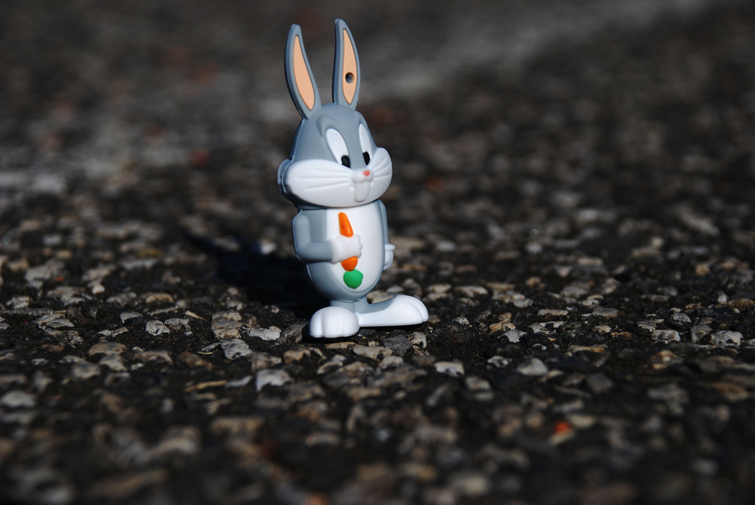
For this photograph I changed the levels to increase the quality of the image. When I changed the levels it increase the contrast between the bunny and the asphalt as well as making all the colors richer. I love the way that the carrot colors and the ears and nose colors are so vibrant. The grays and whites in the bunny are really great against the background. I think that he has greater depth due to the change
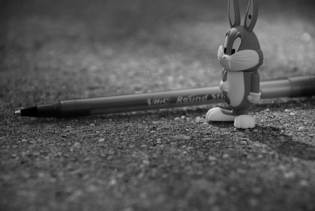
For this photo, I made it black and white. To enhance it, I changed the black and white by making the values that were originally blue, darker. I did this because the pen was blue and it made it more of a focal point and make it stand our more against the background. I also made values that were green darker in order to make the top of the carrot darker and increase the different values in the bunny. I really like how the black and white edit really makes the bunny's feet look really good against the background and when I look at it I feel like I could touch him.
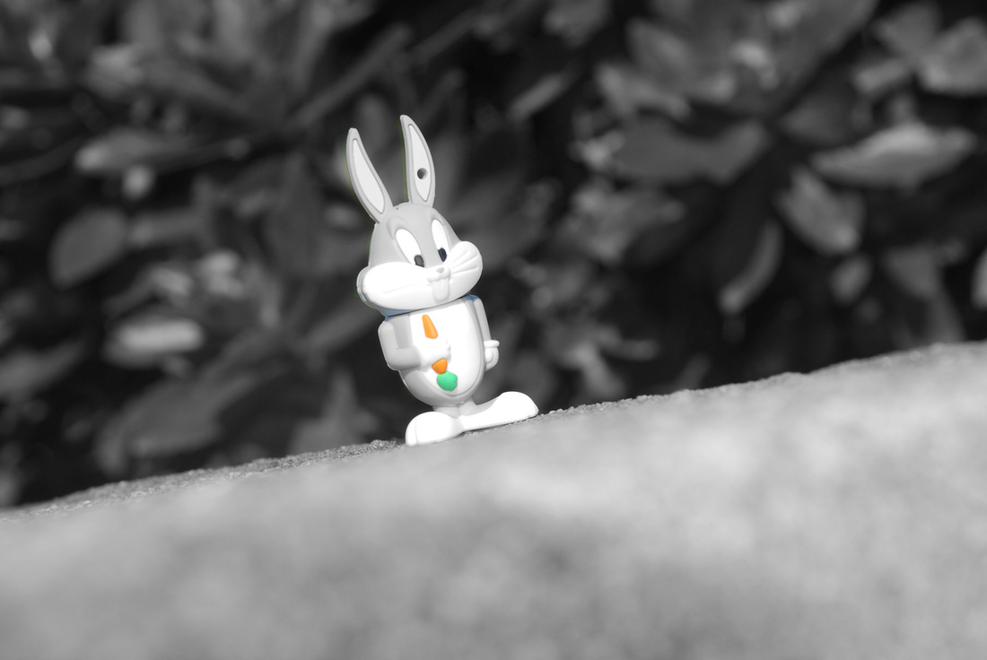
For this photo, I left the carrot in color and made the rest of the image black and white. I think that it brings focus not only to the carrot because of how it contrasts the background but the focus it brings to the bunny. I made the green values darker so that the greenery in the background allows the lighter values of the bunny to stand out against it. If i could change something about the image it would be to have the foreground less blurred. Also I would like it to be darker without the bunny being darker so it could stand out more.
